“Words tell us what we, as a society, believe the world to be.”
— Alberto Manguel
“Typography is the visual component of the written word .”
— Matthew Butterick
“I think that the reader should enrich what he [sic] is reading. He [sic] should misunderstand the text; he [sic] should change it into something else .”
— Jorge Luis Borges
Type makes manifest, but what will manifest the type?¹
While many typeface designers and typographers will employ software in all stages of the design process – from exploration, development, design, production to distribution, promotion, sales, and analysis – there has been little enquiry into the typography of these softwarised modes of production. That is not to suggest that type designers have not engaged in the possibilities of working with software, but rather that the digital tools and techniques used by designers have largely escaped typographic attention.
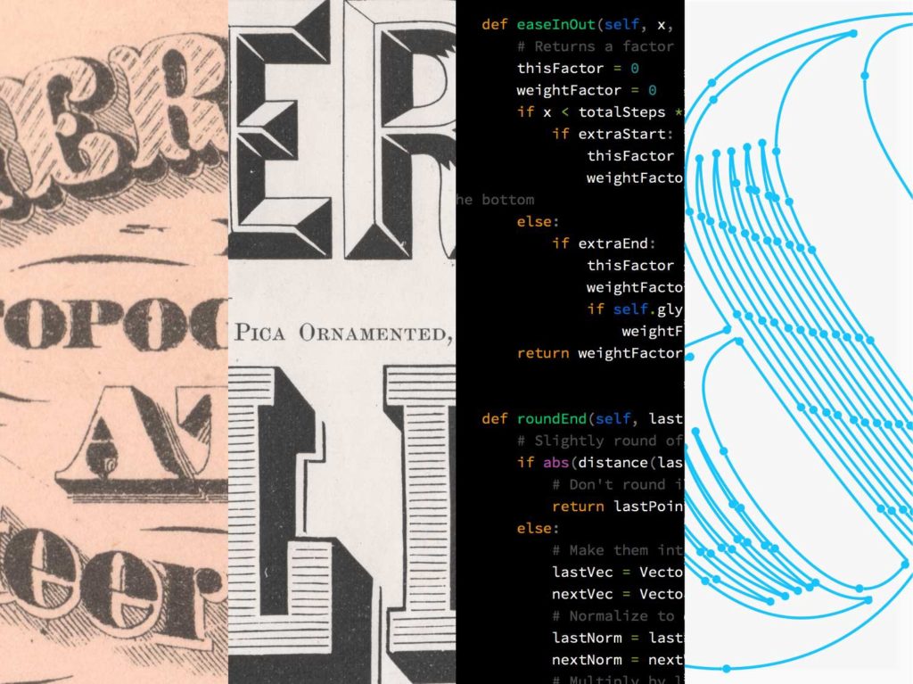
Figure 1: An image showing certain aspects of the design process involved in the creation of Obsidian by Hoefler and Co.

It may be useful to look at an example. Figure 1 is an image taken from an article posted by Hoefler & Co that details the production process of their typeface Obsidian. Obsidian is a design that was influenced by 19th century engraved letterforms and decorative printing types. Such designs made extensive use of hatching and other techniques to visualise the textures and shadows. To recreate these intricate patterns as vector outlines would entail a significant amount of work. As Jonathan Hoefler notes, “Type design is still largely a manual art, and the thought of devoting years of our lives to drawing tiny curlicues was a bleak prospect indeed” (Hoefler, 2015). For Andy Clymer, senior typeface designer at H&Co., the answer lay in developing software tools that could circumvent labour-intensive approaches. The scripts that Clymer developed automated much of the drawing process, not only making a potentially costly project viable but also enabled the team to explore aesthetics that would have been difficult to conceive of otherwise.
Certain instances of the design process are shown in Figure 1. The left half of the image depicts two scans of printed reference material while the right half contains screenshots of software interfaces used in the design process. What is interesting to note is how code is presented as a tool, a textual interface not a typographic surface. Indeed, the article opens with the following subheading: “A majestic typeface uses digital means to achieve traditional ends” (Hoefler, 2015). Code is valorised for its technicity, typography for its historicity. It appears that as the typographic possibilities of softwarised surfaces flourish the typography of textual interfaces recedes. This imperceptible quality aligns with certain ideals within typeface design and typesetting where producing an even tone is seen as beneficial for reading a text.
Marking Mediation
Johanna Drucker makes a distinction between texts that are marked and those that are unmarked that may be useful here. Unmarked texts are those that foreground the text over its visual-material form. As Drucker writes,
‘[Gutenberg’s] bibles, with their perfectly uniform grey pages, their uninterrupted blocks of text, without headings or subheading… are the archetype of the unmarked text, the text in which the words on the page “appear to speak themselves”… Such a text appears to possess an authority which transcends the mere material presence of words on a page…” (Drucker, 1994: 95).
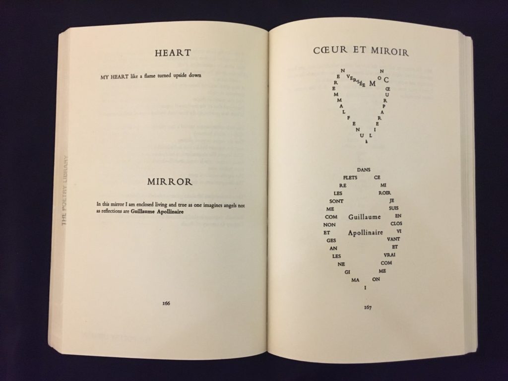
Unmarked and marked are best understood not as discrete categories but existing on a continuum. Humanist book typography would be situated closer to the unmarked end while a calligram would be positioned near the marked end. For example, figure 2 shows a spread in which the arrangement of the two English translations presented on the left page is unmarked while the pictorial quality of Calligrams makes them marked.
Figure 2. The visual-verbal simultaneity of Apollinaire’s Calligrams alerts the reader to both the textual and pictorial aspects of his poems.

To be sure, both markedness and unmarkedness are intentional and not the result of naive or ill-informed design decisions and/or (re)production errors. Similarly, calling a text unmarked avoids the problematic connotations of neutrality. Just as bodies don’t disappear when we are attentive to what the speaker is saying, so an unmarked text is not neutral but rather does not make markedness a part of its meaning. To say a text is unmarked simply states that any meaning that is derived from the layout is unintentional. Markedness then refers to typography that is involved in meaning-making.
Central to a marked text then is that the visual arrangement becomes important for inferring meaning. A design that created “an order in the text so that different parts appear to ‘speak’ differently” (Drucker, 1994: 95). As such, texts that are unmarked (or marked minimally) are often aligned to hermeneutical interpretations while a marked design elevates the visual aspects of the text making semiotics a part of its meaning-making.
From Ideogram to IdeoProgram
If we now return to code, we may be forgiven for thinking that its visually striking appearance would make it a marked text. However, these visual qualities do not infer any meaning but rather facilitate the coder in a manner that is comparable to book typography. The text in a book is unmarked (or marked minimally) as it prioritises reading while the text of code is marked minimally as it prioritises the scanning and editing of a program.
However, a rich variety of approaches have been developed that utilise visual-textual simultaneity and markedness to highlight certain aspects of the technicity of code. Such work is valuable in shifting our understanding of code away from a strange complex tool and towards a creative, cultural end. Code becomes a site of exploration in itself.
Some particularly interesting examples are those submitted to the International Obfuscated C Code Contest (IOCCC). The competition itself was instigated by Larry Bassel and Landon Curt Noll in 1984 with the goal being to write the most complicated looking C program possible. As the name implies, obfuscated code is code that is made deliberately difficult for humans to read and understand but remains executable by the machine. Indeed, obfuscation should give no clue to the reader as to how the program is logically and functionally constructed.
Obfuscation can alter both the textual and functional structure that makes a program human readable. For example, in the C programming language, there are multiple ways of inputting the same information. For example, the computer reads both 0 and ‘-‘-‘- as zero. Other typographic ways of obfuscating the text involve the transformation or elimination of secondary notation, for example through the addition of space or minification (the removal of all unnecessary characters, such as space).
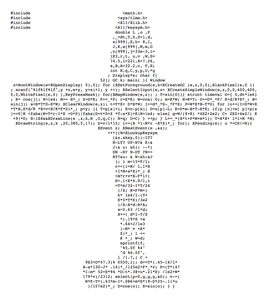
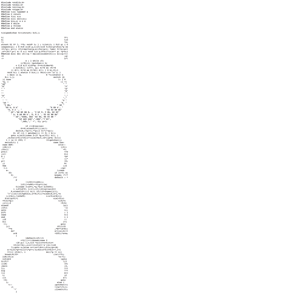
Over the years entrants have used such techniques to shape their code so that it visually resembles the program. For example, source code has been shaped to resemble all manner of things, from mazes; fractals; arrow pointers; faces; and an airplane. Obfuscation makes the code illegible (to humans, even ones well versed in that language), while the visual layer points towards what the programmer will do when run. Thus, it is the typographic arrangement that provides one with an indication of the program’s functionality, not the code itself. As one programmer notes, “if you’re not sure what it does, looking at the code should give you a fair idea” (Rosten, 2001 cited in Berry, 2011: 90). One does not read to understand but engage with visual-textual simultaneous works in an attempt to understand their technicity.
Here are some examples.
Such designs have been influenced by ideogrammatic writing such as ASCII art; concrete poetry; typewriter art; calligrams and modernist poetry; technopaegnia; and mimetic symbols. However, what makes ideogrammatic code particularly interesting is that it involves two distinct forms of cognition: human and machine. The computer reads what is illegible to humans (the obfuscated code) while the humans recognise the visual arrangement that is dismissed by the machine. As such ideoprograms extend Apollinaire’s notion of simultaneity, alerting the reader to the relationship not just between the visual and the textual but technicity itself.
For much ideogrammatic poetry and code, it is the typography, not the typeface choice that is made central. In the examples shown above the choice of typeface is not stipulated by the coder but is rather arranged to work with an unspecified monospaced typeface. Beyond the visual arrangement of the code then, there is no exploration of typography itself – for example, typeface choice is not stipulated, nor weight, size, style, ligatures, or any other typographic variant. This is largely down to applications programmers work with and the multiplicity of situations in which that code will appear. But typeface choice mediates the message as much as typographic arrangement.
While typographers and typeface designers have worked closely there is no equivalent relation between coders and typeface designers. Certainly, there have been innovative developments in this area (e.g. Pragmata by Fabrizio Schiavi and Input by David Jonathan Ross to name just two) but these tend to focus on the practical concerns of the coder rather than explorations of mediation itself.
We should therefore ask what new approaches to creativity could we discover if coders, graphic designers, and typefaces designers worked with the social scientist and the critical theorists in new collaborative configurations, to connect and develop work and ideas together. Not just for the sake of novelty but as an examination of the computational mediation of society? Aligning this work to questions of explainability would be a valuable way of demonstrating design’s values to society and democratic politics.
—
This text is a development of a paper I gave at the Face Forward conference in Dublin, 2015.
With thanks to: Professor David M. Berry for alerting me to the work of the IOCCC and his support over the years and Luke Prowse for inviting me to publish this text.
Figure 1: Hoefler, J (2015) Hoefler, Jonathan. “Inside Obsidian” Hoefler & Co, https://www.typography.com/blog/inside-obsidian
Figure 2: Apollinaire, Guillaume, and Roger Shattuck. Selected Writings of Guillaume Apollinaire. New York: New Directions Books, 1971. Print.
Footnotes
¹ A reference to Barry Turrell’s statement, “Light makes manifest, but what will manifest the light?”
² To be sure, there is nothing problematic with such an approach in itself.
References
Berry, D. (2011). The Philosophy of Software: Code and Mediation in the Digital Age. Basingstoke, Hampshire New York: Palgrave Macmillan.
Drucker, J. (1994). The Visible Word: Experimental Typography and Modern Art, 1909-1923. Chicago: University of Chicago Press.
Hoefler, J (2015) Hoefler, Jonathan. “Obsidian Design Notes” Hoefler & Co, www.typography.com/fonts/obsidian/design-notes.
About Marcus Leis Allion
Marcus Leis Allion is a typeface designer, graphic designer, and Senior Lecturer in Graphic Design at Kingston University.


