This article is a narrative about the first Telugu movable type cut by the East India Company at Madras between 1800 and 1802.
1. Introduction
The East India Company (EIC) saw the necessity for its personnel to learn the vernacular languages spoken in the areas it operated to communicate with its residents. Madras, the capital of the Madras Presidency, was multilingual. The Hindu population spoke Tamil and Telugu. The Muslims used Hindustani (currently referred to as Urdu, one of the two significant registers of Hindustani).
Therefore the EIC intended on publishing a grammar and dictionary of the Telugu language. However, the first printing in Telugu was short texts in multilingual newspapers printed at Madras. In 1795, the Government Gazette, edited by John Goldingham (1767 – July 1849), and the Madras Gazette, owned by the EIC’s solicitor, Robert Williams (23 April 1735 – 17 January 1814), was founded. These two papers printed content in English and contained some additional material in Tamil, Hindustani (Urdu), and Telugu. The intention to publish saw the requirement for a Telugu type.
The Government Gazette published the first printed material using movable type in the Telugu on Thursday, 1 April 1802 (Image 1). This text is a translation of a government advertisement published in English. The translator is uncredited, and the quality of the text is unintelligible. Francis Whyte Ellis (1777 – 10 March 1819) initiated this first Telugu foundry type (referred by the name FET in this article).
Image 1: Front page of the Government Gazette, printed at Madras, dated 1 April 1802, in multilingual settings using Latin, Telugu, and Arabic scripts. This newspaper is the first known printed material in Telugu using foundry type. Courtesy British Library.
2. Francis Whyte Ellis
Francis Ellis started his career as a writer in the EIC in 1796 and quickly ascended through promotions, to the assistant-under secretary, deputy secretary, and secretary to the Board of Revenue in 1798, 1801 and 1802 respectively. In 1806 he was appointed as the judge of the zillah of Machilipatnam, and in 1809, the collector of land customs. He finally ascended to the post of the collector of Madras in 1810, a position he held till his untimely death due to cholera at Ramnad, Tamil Nadu in 1819[1]. Ellis supposedly introduced vaccination against smallpox in the Madras Presidency. He was a member of the Madras Literary Society and the College of Fort St. George’s founder in Madras in 1812. Ellis was the first to suggest the ‘Dravidian Proof’, a step by step attempt to establish that the Dravidian languages are interrelated and not derived from Sanskrit.[2] He elaborated by writing the note to the introduction in Alexander Campbell’s A Grammar of the Teloogoo Language, commonly called the Gentoo, elaborating the theory in 1816. However, as anticipated, Ellis was an EIC loyalist and colonialist. This outlook is particularly evident as he intended to impose a measure of censorship by reserving the use of FET solely for the EIC and restricting the printer from using it.[3]
3. Composition method
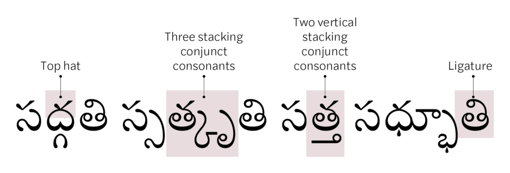
Ellis’s primary challenge in making a Telugu type was to arrive at an efficient composition method that ensured uncomplicated type making and typesetting processes. Alphasyllabic scripts consist of base characters (consonants and vowels) and diacritics (vowel markers). The consonants have an inherent vowel that can be changed or muted by adding a vowel marker. When written in the initial position, the vowels retain their full form. Two or more consonants without the inherent vowel can combine to form a conjunct consonant. In the formation of conjunct consonants, the initial consonant retains its full form. In contrast, the combining consonant sits to the bottom right, and occasionally vertically below the primary consonant (Image 2). The vowel markers usually combine with the consonant’s upper part to form ligatures. These features make the Telugu script dynamic specifically in comparison with the Latin script.
Image 2: Defining the Telugu script features typeset with Tiro Telugu typeface designed by Fiona Ross and John Hudson.
The process of type making was script agnostic. Yet, decisions made before cutting punches usually attempted to address issues that may arise during the typesetting process by anticipating the typesetter’s constraints. Ellis’ examined the composition methods of other vernacular types and tried to devise an efficient way for typesetting the Telugu script. Ellis wrote that if cast each combination individually, Telugu would require an upward of six thousand sorts. This number of sorts would make the typesetting process tedious.
Ellis hypothesises two different composition methods that can effectively reduce the letterforms by dividing the repeating shapes into components. He suggests placing the main letterform sort without the inherent vowel in the middle and adding subscripts and superscripts to complete the letterform, in his first method. This method would reduce the total number of sorts to about seventy or eighty. However, Ellis does not find this method efficient as it requires three rows to typeset a single line of text. Ellis adds that for ‘reasons that are tedious to mention’, this composition method was inadequate to render the Telugu script with sufficient freedom.[4]
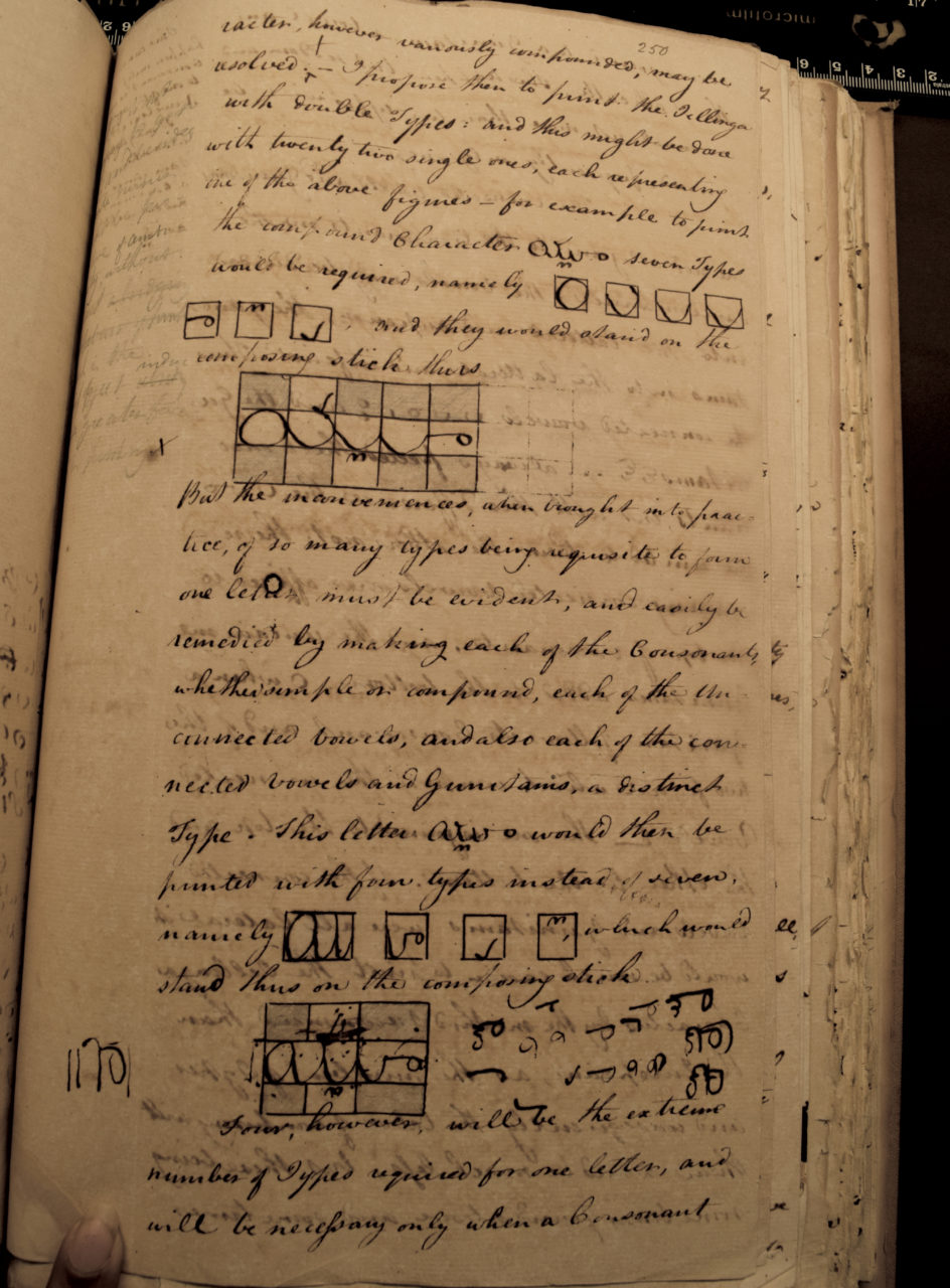
Ellis also proposed an alternate method from his understanding of typesetting practices of the Arabic script. The letter branches out from the type’s shaft to the place it should occupy above or below the character, in the second method. Ellis preferred this method as only a single line is required to typeset combining forms as well. However, the apparent disadvantage is the fragility of types. The branching out forms is prone to breakage with usage, making this method inefficient (Image 3).[5]
Image 3: Page 250 from The Ellis Papers given by Rev. Dr. Pope. In this page, Francis Whyte Ellis explores the composition methods to render the Telugu script as movable type. Courtesy of the Bodleian Library, University of Oxford.
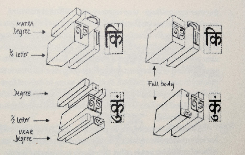
According to Fiona Ross, the scripts of the Indian sub-continent when rendered as type were addressed by two composition methods. Three steps are involved in the Degree method. The main character is placed in the middle, with the subscript and the superscript set below and above. The Akhand system depended on the backing of kerning components by the shoulder of neighbouring characters (Image 4).[6] These two composition methods are similar to those proposed by Ellis.
Image 4: Degree (left) and Akhand (right) methods of composition (based on the illustration in Naik, B.S, Typography of Devanagari, 1965), reproduced from Ross and Shaw, Non-Latin scripts from metal to digital type. P. 143.
Ellis also proposed a third method that combines the two above discussed methods. By combining, he felt that printing in Telugu would be an easy task. However, these notes appear to be his initial concepts and not a definitive account of the method of composition of FET.[7]
4. Credits and the cost of FET
Financial records indicate that the total cost of the cutting of FET amounted to ten thousand and four rupees, and twenty-three paisa (Rs. 10,004.23).[8] A letter dated 15 October 1801, suggests that the EIC awarded Ellis a donation of one thousand pagodas to undertake the endeavour.[9] Supplementary financial statements indicate an additional cost of one thousand two hundred and ninety-nine and sixty-star pagodas (1299.60) were incurred in cutting FET.[10] In the early 1800s, currencies such as the rupee and pagodas were not standardised, with regional variations within India. Therefore, it is difficult to predict its conversion rate, though it was possibly a considerable sum. These documents also suggest that the EIC paid four workers for unexplained labour. Six others were involved in filing and casting the sorts.[11] Typical of records from the colonial period, the identity of the workmen has not survived. However, Ellis also writes that one person was responsible for cutting the punches. The workmen employed in casting the letters were common goldsmiths. Those in filing it were locksmiths, little skilled in their art, and not at all at type-founding.[12]
5. Criticism
The FET is an aesthetically inferior fount. The lack of competence in the technique of cutting punches on Ellis’s behalf and the workmen who undertook the task is evident in the final quality. Ellis was aware of his limitations and did not consider FET a quality type. He wrote that the type composition’s quality depends on the grade of the available raw materials and the workmen’s adeptness who incorporate the different elements together. He criticised his workmen’s proficiency for not excelling at their trade and the low production quality of FET. In addition to the raw materials’ quality, Ellis estimated the fount’s durability depended on the technicality of execution. If the punchcutter cut the punches to a reasonable depth, and the hollows (counter forms) were proportional to the respective letter’s width, the resulting sort would have a deep face. Also, the punches had to be stuck deep in the matrices to achieve a well-executed sort, attributes that FET lacked resulting in its low quality. And even if the punches and materials were perfect, it required experienced type castors to prevent the letter from coming out defective from the mould. Therefore, the likely inexperience of the workmen resulted in those types being shallow.[13] Nevertheless, Ellis’s criticism of the workmen might be a little severe, as the instruction level provided to them could have also been equally shortcoming.
The cutting of the FET type under the supervision of Francis Ellis took 13 months. Fred Smeijers suggests that making one punch using the counterpunching and cutting method takes about three and a half hours. This significant time suggests the apparent lack of knowledge, experience, and skill in the typefounding process. Yet it satisfied the mission of rendering the Telugu script as foundry type and commenced printing in the Telugu script.
This article is an excerpt from my PhD thesis, ‘the development of typographic forms in the Kannada and Telugu scripts, Department of Typography and Graphic Communication, University of Reading.
Additional Reading:
- Blackburn, Stuart H. Print, folklore, and nationalism in colonial South India. (Delhi: Permanent Black, 2003).
- Naik, Bapurao S. Typography of Devanagari. (Bombay: Directorate of languages, 1965).
- Shaw, Graham. ‘The beginnings of government and commercial printing in India’ published in Les débuts de l’imprimerie gouvernementale et commerciale en Inde. (Revue francaise d’histoire du livre 53; 1984).
- Tharoor, Sashi Inglorious Empire: What the British Did to India. (United Kingdom: Penguin, 2018).
[1] Prinsep, Charles Campbell. Record of services of the Honourable East India Company’s civil servants in the Madras Presidency, from 1741 to 1858. (London: Trübner and Co., 1885). p.50.
[2] Trautmann, Thomas R. Languages and nations: The Dravidian proof in Colonial Madras. (California: University of California Press, 2006).p.151.
[3] The Ellis papers given by Rev. Dr. Pope, MS Tam C19, The Bodleian library. p.245.
[4] Ibid. pp. 240-243.
[5] Ibid.
[6] Ross, Fiona. The Printed Bengali character and its evolution. (Kolkatta: Sahitya Samsad, 2009). p.135. 7. The Ellis papers… pp. 240-243.
[8] The Ellis papers… p. 261.
[9] F/4/117. The British library. p.1.
[10] Ibid.
[11] The Ellis papers… p. 261.
[12] F/4/117. p.45.
[13] Ibid. pp. 46-47.
[14] Smeijers, Fred. Counterpunch: making type in the sixteenth century, designing typefaces now. (London: Hyphen Press, 2011). p.127.
About Pria Ravichandran
Pria Ravichandran is an alumnus of the University of Reading, having completed a Masters’s degree as well as her doctoral research in the development of typographic forms for the Kannada and Telugu scripts (1801–1900). She focuses her design practice on south Indian scripts. She held the position of Chief Design Officer at URW Typefoundry and has released fonts with Monotype and Google Fonts. She is currently a Director at Foundry5, a type initiative that focuses on offering high-quality global scripts.
